


In the Fall of 2016, I finished up my undergraduate degree at Rensselaer Polytechnic Institute. The following project is the final output for my User Experience Design for Games class. The assignment was to conceptualize and visualize an interface for a time machine. This assignment was a departure from the usability research we had been working on for the majority of the semester and was a great opportunity to think outside the box and conceive a system from start to (almost) finish.
"TIME" is a closed loop, past only time travel system developed for strategic military use in the early 2030's. In 2038, the technology was released as a heavily government-regulated productivity tool for the elite, vetted professionals. The Federal Time Authority (FTA) was created as a branch of government tasked with the licensing, education, monitoring of the "TIME" devices, and the upkeep of laws surrounding the use of the "TIME" devices.
When the user decides to go back in time, they use their "TIME" device issued to them by the FTA after they have received their license to travel. The user's body, henceforth referred to as body alpha, travels back in time, but not space. Body Alpha then exists for a few hours in the past with the past version of their body, Body Beta. Both Body Alpha and Body Beta exist in the same time loop until Body Beta goes back in time and Body Alpha continues forward alone.
Heavily inspired by the closed loop time travel systems in both the Harry Potter universe and Primer, "TIME" is designed to be a believable, practical application of time travel. I want to create a system that feels like it exists in a not so distant future; one that is almost tangible. The government regulation aspect of the "TIME" system is one that I find lends itself to that element of believability. Each device is heavily regulated and monitored, as it would be in a world in which time travel did exist. My design aesthetic pulls heavily from science fiction in film and TV shows. It is elegant in its reductionism but has a cold, utilitarian motif. The style sheet created with the “TIME” logo is shown below.
"TIME" runs on a handheld tablet roughly 6x3 inches equipped with both a camera for iris scanning, facial recognition, and time travel licence scanning capabilities and a sensor on the back for reading DNA from a skin cell sample. The device needs to be easy to conceal and compact enough to travel with someone in a pocket. At a glance, the user can access high-level information from the front of the device. The device only transports the singular, licenced user and will not transport more than one person. It uses the DNA sample received upon sign in to determine which cells are to be relocated to the desired arrival time.
"TIME" is a luxury product and service. As a government body and commercially available version of the military and espionage technology, it holds a monopoly on the time travel market and is violently expensive. "TIME"'s target audience is businessmen and women that use time travel as a productivity tool. Whether it is to attend two important meetings at once, or have time to take a short lunch break during the day, "TIME is an expensive option to optimize the day.
Since the technology is new, the interface employs a familiar ease to render the required software extremely usable for the client. The average user has been working with technology since birth, they are native to the nuances of software interfaces as they have evolved to be optimized for usability. Despite the ease of use, the nature of a time-traveling service is risky and therefore an extensive on-boarding process in addition to a require class is put in place to ensure that nothing goes awry during the user's travel. There is a lengthy process to obtain a license to operate "TIME" and receive a travel device. The wait list is as few years long and only one hundred or so licenses are issued per year. There is a way to pay for an expedited license. However, the cost is so high that it limits this option to the extremely wealthy. The rich patrons of time travel are willing to pay this exorbitant price and have limited the market to only the very top of the 1% by flooding the top of the waiting list.
The design of the interface is crafted such that the user has an easy time navigating it and proper precautions are put in place to ensure a safe, legal travel. Users are urged to keep their device and license private to avoid theft and the software employs heavy security measures to ensure that the license holder is in fact the person traveling in time. While some users find these security measures to be lengthy, the value of security is understood; the license holder is liable if something goes wrong.
Upon turning the device on, the user is presented with a dark navy screen with two buttons: Register and Sign In. The Sign In button is closer to the thumb for ease of access. Once one button is selected, there is a state change on that button as demonstrated in Figure 1 before proceeding to the next screen. A recent MIT study found that the minimum viable area a finger pad can hit is between 10-14 mm. All buttons in this application are a minimum of 20 mm.
The dominant color of navy blue was chosen for its projection of both reliability and strength. Dark blue shades are consistently used for business to project both a calmness and a responsibility. This particular shade of blue borders on the purple end of the spectrum. Purples, traditionally, are known to add a sense of luxury and refinement.
The first step in registration is the entry of the user's full name, social security number, and the scanning of the user’s travel license. Upon page load, a keyboard slides up from the bottom of the viewing pane.
Each form field is prefilled with placeholder text. Once the user taps into the field, the label animates up so that the user can keep track of what they should be typing after tapping in. This is visualized below in Figure 2.
A dark themed keyboard is employed to keep a seamless flow with the darker background. The keyboard retracts when the user taps out of a form field or into the pane to take a picture of the license.
When the user taps into the Scan Licence window, the camera view takes up the full pane. Upon capture of the license, the user is returned to this view with the license image in place of the rectangle with the icon. The Next button is then transitioned from the inactive state to the active one. Upon tapping the Next button, the state changes again to signal to the suer that the button tap was received before moving on to the next Registration panel.
The second step of Registration is a scan of the iris, face, and DNA. The user follows the instructions provided and is taken to a front facing camera view.
When the camera opens, the user's face is scanned for both an iris and facial read. The user can see the scan appear on his or her face in the form of a geometric mesh to ensure the user that the software is scanning. As the scan reads the information, the tree items on the bottom of the viewing pane switch from an inactive state (greyed out) to an active one (white). When all three reads are finished, the user is automatically taken to the final registration page, setting a text-based password.
If any of the three scans are not properly detected, the user is served a modal window with instructions to help the device get a better read. And example is outlined in Figure 3.
After the user has identified themselves with the system and paired with the device, the user must set a text based password. Each line of the form field has three parts: the placeholder text, a label, and directives. On tap into the form field, the placeholder text animates up to create a label. Underneath each line, there is a set of requirements the user must meet for a strong password. As the user hits each requirement (capital letters, lower case letters, numbers, special characters, and a minimum length of 8 characters) the met requirement brightens to pure white. With this paradise, the user can keep track of what makes up their password without additional text or instruction. When the user has entered two matching passwords, the Next button changes to its active state. After tapping the Next button, it changes again to its grey state, as demonstrated in Figure 4.
The user is then taken to the Terms of Service.
The first step in signing in is the entry of the user's full name and password. On page load, a keyboard slides up from the bottom of the viewing pane.
Each form field is prefilled with placeholder text. Once the user taps into the field, the label animates up so that the user can keep track of what they are supposed to be typing after tapping in. When the user successfully types his or her name and password, the button state changes from grayed out to white to signal to the user that they have entered the correct information. This is visualized in Figure 5.
The keyboard retracts when the user taps out of a form field.
Upon tapping the Proceed to Scan button, the button state changes again to signal that the tap was registered before moving on to the front facing camera view seen above in Register - Face, Iris, and DNA.
The Terms of Service document is one that the user must agree to in order to proceed. The document is split up into two columns by section. The column on the left is the legally binding document containing the full text in a more technical language. The right column is the same content translated into a more layman's tone for ease of understanding and is not legally binding. This concept is outlined in the header text above the document.
The page itself is divided visually by blocks of muted grey-blue. These blocks serve as a visual aid to separate the official document from the instructional header text.
This is the first screen that presents the top bar to the user. The icon on the left takes the user to their Account. The current time is found on the right.
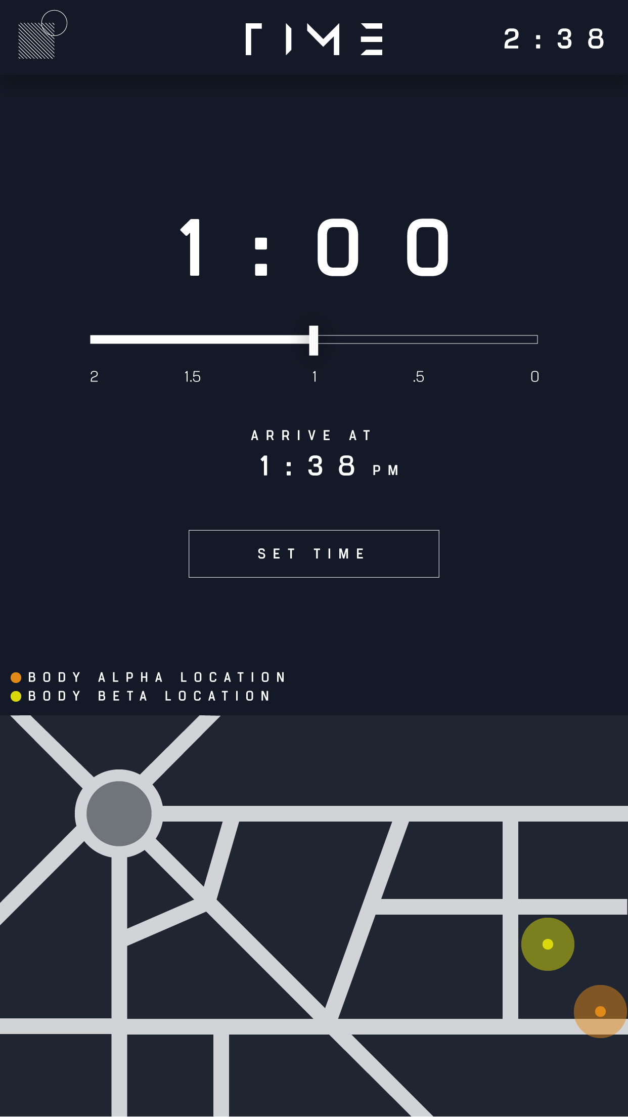
After the user agrees to the Terms of Service, he or she sets the amount of time they would like to travel back in time. the user has the current time in the upper right-hand corner. In the center, there is a time stamp that, on page load, reads 0:00 with the slider all the way to the right. As the user drags the slider to the left, the time on the clock increases, The slider is limited to the number of hours each user is licensed to travel. The slider is oriented such that the user uses a subtracting motion to mimic the backward moving of time they are about to experience. The arrival time is set above the Set Time confirmation button.
The bottom third of the screen is occupied with a map displaying both the Body Alpha and the Body Beta locations at the time of arrival to ensure that the user is far away enough from their Body Beta so as to not break any laws regarding proximity to the Body Beta.
After the user taps the Set Time button, the button undergoes a state change to assure the user that the button was tapped.
Before the user can travel, he or she must first read and agree to the rules surrounding their travel. This is for the legal protection of the "TIME" software, device technology and also for the user's own awareness. Some of the rules outlined in this statement are prosecutable offenses.
All of these statements have been confirmed in their legal language in the Terms of Service document. This restatement of regulation is only outlined in layman's vernacular.
Each statement is accompanied by a square to be tapped once the user has read and agrees to the statement. Once tapped, the square fills in. When each box has been tapped, the Confirm button at the bottom of the pane changes to its Active state. After it is tapped, it changes again to its gray state to give the user positive feedback (Figure 7).
The user has a final opportunity to change their arrival time and check their Body Beta location before choosing to depart. If they choose to edit their arrival time, they are taken back to the Setting the Time page and must confirm the regulations for the second time. This is set in place to make sure the user is acting with confidence and is not tapping anything accidently. After tapping either button, the button undergoes a state change as demonstrated in Figure 6.
When the Depart button is pressed, the user is taken to the Countdown page.
The user is presented with a countdown to have a final ten seconds to choose to opt our of the travel. After the ten seconds are over, the user is automatically transported.
The abort button is a bold red. This is to make the button pop in case of emergency. The user needs to be able to find it to opt out at the last second if they change their minds.
If the user does choose to hit the Abort button, they are presented with a notification, Figure 9, and are taken back to the Setting the Time page.
While the user is traveling, the screen they are presented with contains two elements: the time left in their cycle in which two copies of their body exist in one timeline and a map outlineing where those two copies are. The information on this screen also appears on the users locked device so that they do not have to sign back in to view the time remaining in their countdown or their Body Beta location.
The screen is designed to provide only the information the user needs at a glance.
If the user gets too close to their Body Beta, an error message appears and the user is warned to keep a minimum distance from their Body Beta, as demonstrated in Figure 10.
The time in the upper right-hand corner has updated to reflect the current time for the Body Alpha.
When the user’s travel is finished, the user is returned to the Setting the Time page.
The icon in the upper left corner slides the Account information pane in from the left. Once on the Profile page, It reverts to an arrow that the user has an easy, clear way to return to whatever page they had just left.
There are three tabs across the top for easy categorization: Account, Billing, and History. Account details the user's personal inforamation, licence inforation, and the options to change their information or update their password.
The layout is a columnar grid for easy readability.
When either button is tapped, the stat changes to grey, as demonstrated in Figure 11.
Under the billing tab, the user has access to their payment information stored within the “TIME” system. The user has the option to update this information at any time.
The history section of their account allows the user to see their travel history receipts along with an option to contact their FTA Agent if anything did not go according to plan.
www.adobe.com/products/illustrator