


In the spring of 2016, I was tasked with creating an electronic magazine for GYRE. In addition to an updated branding scheme, they were interested in curating in-house articles to illustrate their views on impact investing, finance, and the future of philanthropic investment opportunities. The magazine needed to be sleek, easy to navigate, and a projection of where GYRE is interested in moving in the future.
GYRE wanted the magazine to have a feeling somewhere in between a traditional magazine and a blog; a semi-formal organization of thoughts and musings for investors to get an idea of the philosophy and investing style of GYRE Capital Management. All of the articles are to be written in-house by the management team at GYRE do discuss their personal missions and current events in the sectors of business that they represent.
The color palette is minimal with accent colors used sparingly. The layout is simple but intuitive.
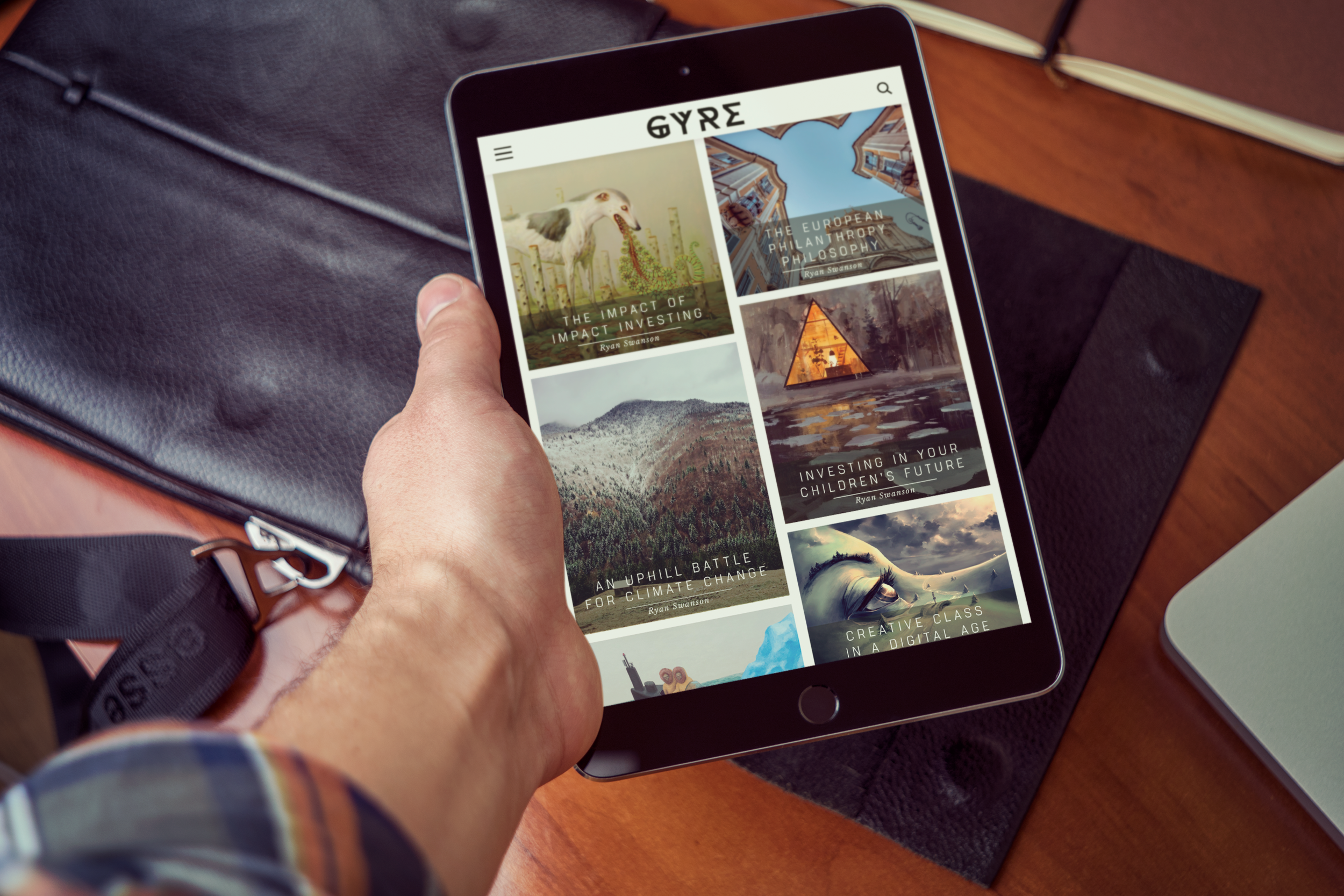
From here the user has two options if they are interested in browsing: using the right and left arrows to flip through featured articles, or scrolling down to view all of the archived articles in a chronological grid.
Once the reader scrolls down to browse in the Grid mode, the upper left hand logo mark animates in giving the user a shortcut to the Home Page, in this case, the top of the scrolled down viewing pane.
The navigation system at the top of the page has adjusted to include an opaque bar so that the navigation item at the top of the pane are not obstructing the article, and the article does not obstruct navigation.
The article begins with the header information: date, title, author, sector of business, and social sharing options. From there, the body of the article begins. The copy is split into two sections divided by a pull quote to break up the large text blocks and highlight the essence of the piece at a glance for readers that are scanning the article quickly.
If the article strikes a chord with a reader who would like to know more about either that facet of GYRE’s business or read more articles written by that author, the reader has those options available to them.
Heavily inspired by the semiotics system used on the International Space Station, traditional nautical uses, and the movie Alien, I designed a series of flags for each sector of business. This concept carries over from both the GYRE and Ambata websites.
If either of the "Read More" links under the author or sector are clicked through, the reader is taken to either the author's page or the sector page respectively. There, the author or sector have a bio available, a link to view other authors or sectors, and all of the articles that fall under either category.
The structure of these two pages is very similar. If the reader takes the author path, they are presented with a top level list of Featured Contributors followed by an alphabetical list of every contributor. On hover over a Featured Contributor's photo, the reader is prompted to click through to read more about that author taking them to the author page found above.
The Sectors page displays the semiotic flag system for each sector represented. Clicking through one of those flags will take the user to the sector specific page found above.
The hamburger menu icon farthest to the right extends the upper navigation bar down to reveal the two categories through which you can filter your articles. The section to the left of the flags and author pictures serves as a toggle between these two views. When selected, the reader is taken to either the page filtered by author or sector shown above.
On click of the Menu icon, the icon animtes into an X to retract the menu and changes colors to emphasize the exit option.
The Share and Search icons also animate down the heading navigation bar. With the Share button, users can share the article or page that they are visiting regardless of where in the article they currently are. These buttons are repeated in the header of every article. The Search feature brings the reader to a full page of search results in a columnar grid format for easy browsing.
The user is presented with a splash image with a featured article. They can then use the arrows on the right and left to scroll through featured articles. There are two menu items in the upper left and right corners: Menu and Search. Once the user has scrolled down past the splash page, a header bar animates in and remains for the duration of the users reading experience.
Each article is allowed a square in the grid with a header image. The title and author’s name are overlaid with a transparent rectangle for contrast against any header image. The height of each rectangle overlay is dynamically sized with a set margin around the text.
The menu system for tablet is vertical as opposed to the horizontal system employed in the desktop version.
www.adobe.com/products/illustrator